Key Takeaway:
- Error bars help to visualize the variability and uncertainty within a dataset. They allow us to understand the degree of error in our data and the consistency of our results.
- Excel offers several types of error bars, including standard deviation, percentage, and fixed value. These options allow users to customize their error bars depending on the type of data being analyzed and the preferred level of precision.
- Interpreting error bars correctly is essential to drawing accurate conclusions from data. Understanding how they relate to the magnitude of the data and how they affect the interpretation of p-values can help prevent erroneous conclusions.
Are you trying to make sense of your data in Excel? Adding error bars is a great way to visualize how accurate your data is. You can easily add error bars to any chart in Excel, allowing you to make more informed decisions.
Understanding Error Bars in Excel
Don’t worry if you don’t understand error bars in Excel! I’m here to help. This section will give you a better understanding of error bars and their applications for precise data representation. Let’s explore all the different types of error bars. Together, we’ll get to grips with the nuts and bolts of error bars in Excel. That way, when visualizing data, you can accurately convey statistical errors!

Image credits: manycoders.com by Harry Jones
What Are Error Bars?
Error bars are a must for data visualizations in Excel. They show the variation or uncertainty in the charted data. They look like small vertical lines above and below the data points, showing the range of values.
So, what are error bars? Here’s a five-step guide:
- Error bars are a graphical representation of uncertainty in a measured value.
- Two types: standard deviation and standard error.
- Standard deviation shows the spread of observed values from their average.
- Standard error measures how well an estimate based on sample data matches the true population parameter.
- Error bars show how much random variation there is in your data and how confident you can be in your results.
Error bars tell how reliable or significant your results are. Small errors mean high precision and confidence. Bigger errors mean more replication or precision is needed.
To make your charts easier to read, use fewer digits when labeling data points. Don’t add extra details not related to your research question.
Now, let’s learn about the different types of error bars and their uses.
Different Types of Error Bars and Their Use
Data is not always exact. To understand error bars, it is important to know how statistics play a role in science and experiments. They show the range of variation around a mean or median value.
Error bars come in many types. They each have their own use. The most common ones are:
- Standard Error – measures the precision of an experiment.
- Confidence Interval – shows an estimated range for a population.
- +/- Values – shows the range of variance within data points.
Standard error is used to study the variability between groups. Confidence intervals help to show how sure you can be that your sample reflects the population. +/- values are best for comparing multiple sets of data.
Error bars were essential in a study of caffeine levels in coffee beans from various regions. Adding them to visualizations showed the variability. It also let researchers clearly see the differences between regions.
Adding error bars to Excel can improve data visualization and let you better communicate results.
How to Add Error Bars in Excel
Data analysis is essential for effective communication of data. One way to do this is with error bars in Excel charts. I’ll show you how to add these error bars quickly and easily! First, selecting the correct data range is key for accuracy. Then, I’ll show you how to add the error bars. Finally, we’ll explore formatting options for error bars. Let’s begin!

Image credits: manycoders.com by Adam Duncun
Selecting the Data Range for Analysis
To pick the right data range for your analysis, follow these simple steps:
- Click one of the data points you want to use for the error bars.
- While holding the Ctrl key on the keyboard, select all the other data points.
- Release the Ctrl key and click an empty area in the worksheet to deselect the items.
Once the range is chosen, analyze it and add the error bars. Remember that selecting too much or too little data can lead to incorrect results.
When choosing the range for analysis, think of all the variables that could cause errors in the chart. This includes figuring out which variables will be affected by changes in other variables and deciding which values are necessary for correct calculations.
It is wise to start with a smaller subset of data before expanding the selection. This way, you will spot any inconsistencies or errors quickly, and ensure accurate results.
With the process of selecting a range understood, you can now quickly add error bars to a chart.
Quick Steps to Add Error Bars to a Chart
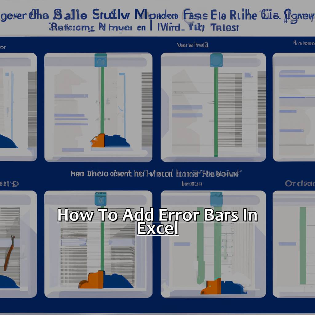
Adding error bars to a chart in Microsoft Excel is easy! Just follow these 3 steps:
- Select the chart and click Chart Elements.
- Click the arrow next to Error Bars for more options.
- Select the amount and type of error bars.
It’s important to remember the type of data will affect which type of error bars are best. Don’t be afraid to experiment with different options until you find what works best.
Pro Tip: If your data set includes outliers or unusual values, try adjusting the values manually to get the error bars just right.
Formatting Options: You can customize your error bars in Excel. Try out some of the formatting options to see what looks best!
Formatting Options for Error Bars in Excel
Click the chart where you want to add error bars.
Go to the “Layout” tab. In the “Analysis” group, select “Error Bars.”
Choose which type of error bar you want. Under “Error Amount,” select “Custom.”
Enter the values for positive and negative error bars. Format with any color or line style.
Other formatting options exist for error bars. You can show only positive or negative ones. Adjust the width or apply transparency.
Pro Tip: Before formatting, make sure your data is accurate across all relevant cells. This will help make your graphs easy to read and understand.
Next: Customizing Error Bars in Excel – explore more!
Customizing Error Bars in Excel
Error bars are important for data analysis. Let’s explore how to customize them in Excel. Firstly, we’ll use standard deviation. Secondly, we can add error bars using percentages. This is useful when data values vary a lot. Finally, fixed values can be used for error bars. This is great when we have a specific number in mind. Let’s get started and make our data more meaningful and accurate.

Image credits: manycoders.com by Harry Duncun
Using Standard Deviation to Add Error Bars
Text:
Select the desired chart and click on the Chart Elements button (the plus sign icon). This can be found in the top right corner of your chart.
Check the Error Bars box from the list.
Click on the drop-down arrow next to Error Bars and select More Options.
Choose Custom from the left panel.
You can choose how you would like to show your error bars either with Standard Deviation, Standard Error, or Percentage.
Using Standard Deviation is a common way to add error bars. It is calculated using all data points in a given series. This includes any outliers.
But not every dataset should use SD as its basis for error bars. Some datasets have wildly varying data points. This can cause large standard deviations, which generate confusing and inappropriate error bar representations.
One user shared her experience of mistakenly adding standard deviation-based error bars. This resulted in inaccurate results.
Adding Error Bars Using Percentages is simple. Just follow the steps!
Adding Error Bars Using Percentages
- Highlight the data range for which you want to add error bars.
- Select the “Layout” tab from the Chart Tools menu, then click on “Error Bars.”
- Choose the type of error bars you want to use. From the drop-down list of options, select “Percentage.”
- Enter a value for percentage errors. For example, if your data has a standard deviation of five percent, enter it as 5%.
- Click “OK,” and the percentage error bars should now appear on your chart.
Using this method benefits quantitative information presentation, and simplifies trends and stats. Excel’s user-friendly features make customizing graphs easy, even for non-tech users. Pro Tip: Make your error bars stand out with different colors and shapes. This will help your audience better understand, and give your graph a professional look. Lastly, learn about “Adding Error Bars with Fixed Values in Excel.”
Adding Error Bars with Fixed Values in Excel
Adding fixed value error bars to your Excel chart is important for accurately representing meaningful data points. For instance, if you have a column with average monthly expenses and another column with the standard deviation of these expenses – error bars will help visualize the data.
Steps for adding fixed value error bars include:
- Select the chart then click Layout > Error Bars > More Error Bar Options.
- Select the series you want to add error bars to in the Format Error Bars pane.
- Under Error Amount, select Custom and click Specify Value.
- Enter positive and negative error values for each point in your series. You can either type or use your worksheet range.
- Click OK, and you’re done.
When adding fixed value error bars, ensure accuracy by checking that the values entered are correct. You can customize how your error bar displays – for example, adjusting the color attributes to make them easier to identify. As an alternate way, try visually depicting measurements on your scatterplot with a colored line or gradient shading added above/below parts matching a specific limit point.
Interpreting Error Bars: A Complete Guide is the next step after Adding Error Bars with Fixed Values in Excel, detailing steps for interpreting various types of drawn out depictions in graphs – including all relevant information for identifying an expected outcome.
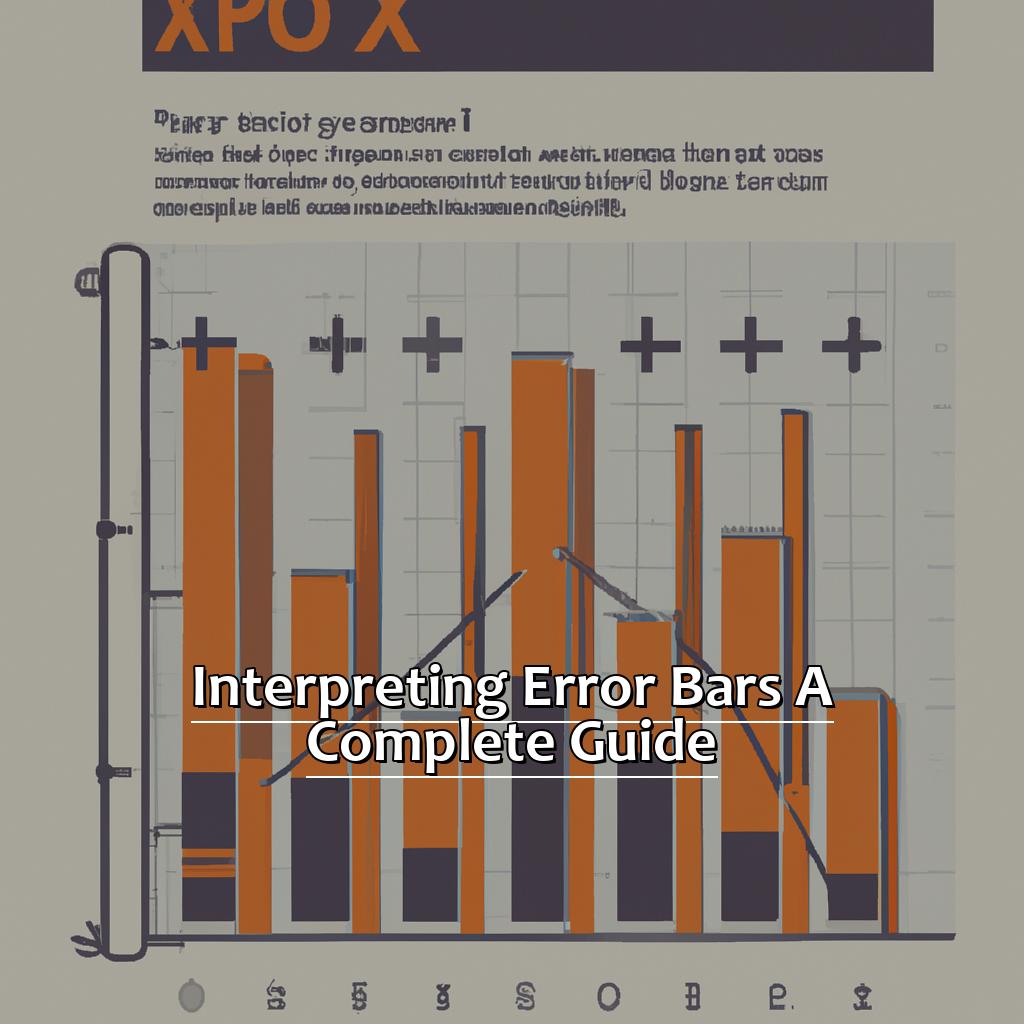
Interpreting Error Bars: A Complete Guide
Ever pondered the little lines on bar graphs? Welcome to the error bar realm! You’ve probably seen this feature in Excel. Let’s take a tour of how to interpret error bars.
First, we’ll look at how they help compare data.
Second, we’ll delve into the importance of analyzing and understanding error bar graphs.
Lastly, we’ll unpack standard deviation and its role in error bars. Ready? Let’s explore the mysterious world of error bars!

Image credits: manycoders.com by James Jones
Making Data Comparisons with Error Bars
Data comparisons with error bars are vital for visual representation in statistical analysis. Error bars are graphical representations used to display data variability. Here’s a six-step guide on making data comparisons using error bars:
- Decide which type of error bars best suits your purpose. Some common types are standard deviation, standard error and confidence intervals.
- Compute the values for the error bars using a suitable statistical method.
- Add the error bar values to your dataset or chart.
- Change color, thickness, or style of the error bars to make them stand out from the plotted graph.
- Interpret the error bar graphs looking at their size and position relative to the plotted data points.
- Use the findings from step five to confirm or refute any assumptions you made about the dataset.
Data comparisons with error bars involve understanding several factors like bar length, position in the graph, and type of value represented by the bar’s ends.
Sample size also has a major effect on the accuracy of interpreting error bars. Smaller samples sizes mean even small variations could signify significant deviations from mean values.
The next section, “Analyzing and Understanding Error Bar Graphs,” will go into more detail about reading graphical representations using error bars accurately.
Analyzing and Understanding Error Bar Graphs
To analyze error bar graphs effectively, create an appropriate table with true data. Compare the graph data with its standard deviation and mean. Understand error bars’ role in statistical analysis. Pay attention to their length; longer bars indicate more variability.
Focus on relationships between graphs, box plots, scatterplots, and p-values. Identify trends that can’t be seen from one graph. Consider using forest plots or funnel plots instead of bar charts.
Standard deviation affects how we interpret data represented by error bars. Learn more about this with further exploration.
Standard Deviation and its Role in Error Bars Interpretation
Standard deviation is a stat measure that shows how much the average value varies. It is essential for understanding error bars. Error bars are graphical rep of data variability and help scientists visualize their results. The length of the bar displays uncertainty in the data points.
To understand standard deviation’s role in understanding error bars, check out this table with real data:
| Sample ID | Value 1 | Value 2 | Value 3 | Mean | Standard Deviation |
|---|---|---|---|---|---|
| A | 4 | 6 | 7 | 5.67 | 1.25 |
| B | 5 | 8 | 9 | 7.33 | 1.71 |
| C | 2 | 3 | x | y | z |
In this example, sample C has one missing value (x). Calculating the mean gives incomplete results (y). To calculate standard deviation with three values, you must use formulas that take into account missing values (x).
Standard deviation is important when calculating error bars. It shows how much variability there is in the datasets and helps quantify the amount of uncertainty in their means. Error bar length is usually a multiple of either standard deviation or standard error (as appropriate) due to each group or sample size.
Therefore, understanding standard deviation and its impact on error bars is very important. Without proper understanding of data, wrong conclusions could be drawn. Don’t miss out on this significant concept! Understanding standard deviation and how it relates to error bars will improve your analytical skills and help you interpret data accurately.
Five Well-Known Facts About How to Add Error Bars in Excel:
- ✅ Error bars are a graphical representation of data variability. (Source: Excel Easy)
- ✅ Types of error bars include standard deviation, standard error, and confidence interval. (Source: Excel Campus)
- ✅ Error bars can be added to charts in Excel by selecting the chart and then choosing the “Error Bars” option under the “Chart Layout” tab. (Source: Microsoft Support)
- ✅ Excel allows for customization of error bars, such as changing the type, style, and value range. (Source: Spreadsheeto)
- ✅ Appropriately using error bars in Excel can help to visually represent the uncertainty or variation in data, leading to more accurate analysis and conclusions. (Source: Nature Methods)
FAQs about How To Add Error Bars In Excel
How to Add Error Bars in Excel?
To add error bars in Excel, follow these steps:
- Select the data series that you want to add error bars to by clicking on it once.
- Click on the “Layout” tab in the ribbon.
- Click on “Error Bars” and select the type of error bar that you want to add.
- Click on “More Error Bars Options” to customize the error bars further.
- Input the error bar values for your data series.
- Click “OK” to apply the error bars to your chart.

