

Key Takeaway:
- Adding axis labels to charts in Excel provides clarity to the reader and helps them understand the data. This is especially important when working with complex charts.
- Formatting axis labels can enhance the visual appeal of the chart and make it easier to comprehend. Customizing font type, size, and color can help draw attention to specific data points and make the labels easier to read.
- Data labels add an extra layer of information to the chart and can provide valuable insights. Formatting data labels by customizing font, adding a background fill or prefix/suffix can help make the data more meaningful for the reader.
Want to easily convey important information in your Excel graphs? You’re in luck: adding axis labels in Excel is simple and straightforward. With a few clicks, you can easily enhance the clarity and impact of your charts and graphs.
How to Add Axis Labels in Excel: Step-by-Step Guide
Make Excel charts stand out! Axis labels can add a professional touch. This guide will show how. First, open the Excel document and select the chart. Then, click ‘Axis Labels’ from the menu. Enhance the look of your charts! Get started now.

Image credits: manycoders.com by Harry Arnold
Open your Excel document
- Open your Excel document by double-clicking a file or create a new workbook.
- Navigate to the graph/chart where you want to add axis labels. Remember, you can only add labels to charts/graphs.
- Click anywhere inside the graph/chart to select it.
- It’s important to add axis labels to make it easier for others to understand the data.
- Select the chart to add axis labels.
Select the chart you want to add axis labels to
To add axis labels in Excel, select the chart you want to edit. To select a chart, follow this five-step guide:
- Open the Excel file.
- Click on the tab with the chart.
- Select the chart by clicking inside the chart area.
- The chart should be highlighted with small boxes.
- Congratulations, the chart is selected!
Now, it’s time to talk about how to add labels for that particular chart. Different charts may need different labeling techniques. So, make sure no other charts are open beside it. If there’re multiple charts in one file/sheet, highlight or color-code them so you can easily identify which needs label.
My own experience taught me not to have multiple charts open at once. Otherwise, I ended up editing the wrong chart while trying to add axis labels. Thus, I had to start all over and spent double the time.
Click on the ‘Axis Labels’ option from the menu
To begin, click anywhere on the chart to select it. Then, go to the ‘Chart Design’ tab on the ribbon. Here, look for the ‘Add Chart Element’ group and click the arrow next to it. From the drop-down menu, select ‘Axis’.
Choose either ‘Primary Horizontal Axis’ or ‘Primary Vertical Axis’ Title. This will help your chart become more informative and understandable.
To further improve your chart, consider adding colors or other visual cues alongside your axis labels. Use clear and succinct language when crafting each title. Also, take into account the layout and orientation of your chart.
Now it’s time to learn about ‘Formatting Axis Labels for Better Visuals’.
Formatting Axis Labels for Better Visuals
Tired of Excel charts that are hard to read? Let’s learn how to make them better! We’ll talk about formatting axis labels with the right font type, size, and color. Plus, find out how to put them in the perfect place with a background fill. Get ready to turn your Excel charts from cluttered to clear!

Image credits: manycoders.com by Joel Arnold
Customize the font type, size, and color of axis labels
Customizing axis labels is a great way to make data presentations look more professional and easier to understand. To do so in Excel, here are the 6 steps:
- Click on the chart.
- Select the label you want to format.
- Right-click to open the drop-down menu.
- Select “Format Axis Label” from the options.
- Expand the customization options by selecting “Font”.
- Use the drop-down menus to choose the font type, size, and color.
For example, a company presenting a chart about their revenue growth could customize the font size and color of the axis label to draw attention to that metric.
So, customizing font types, sizes, and colors of axis labels in Excel is an easy way to make charts look great and be more informative. Onward to Positioning Labels to Fit Charts Perfectly!
Position the labels to fit the chart perfectly
Click the axis label you want to move and hold Ctrl.
Click one of the text boxes and drag to reposition.
Repeat for any other labels.
For readability, adjust font size, angle, color, and font.
Smaller text also helps fill in more space.
Experiment until the labels look right.
A colleague found her labels clashed, so she moved them slightly below each other – problem solved!
To make your charts stand out, add background fills. This adds color and makes different categories or data series visible.
Add a background fill to make it stand out
Make your axis labels stand out from the background! It’ll improve the visual appeal and make it easier to understand. Here’s a 5-step guide to adding a background fill:
- Select an axis label.
- Right-click and select “Format Axis Label” from the drop-down menu.
- Go to “Fill & Line” tab in the “Format Axis Label” dialog box.
- Select “Solid Fill” under “Fill” section.
- Choose a color and transparency level, then click “OK”.
Adding a background fill can help emphasize important data points, but don’t overuse it – too much color can distract viewers from the main message. Pick contrasting colors for legibility. For example, if the text is black, use lighter shades or pastel tones for the background. Align the label text close together or stagger them in intervals for a more streamlined visual experience. Finally, learn how adding data labels can enhance charts.
Adding Data Labels to Enhance the Chart
Excel user? I’ve learned that a fab chart can tell a story. For it to be more effective, add labels! Let’s explore the art of adding data labels. We’ll go through 3 steps:
- Select ‘Data Labels’ option.
- Choose the data points that need labeling.
- Adjust label position – this avoids interference.
By the end, you’ll have mastered the art of making charts more informative and attractive.
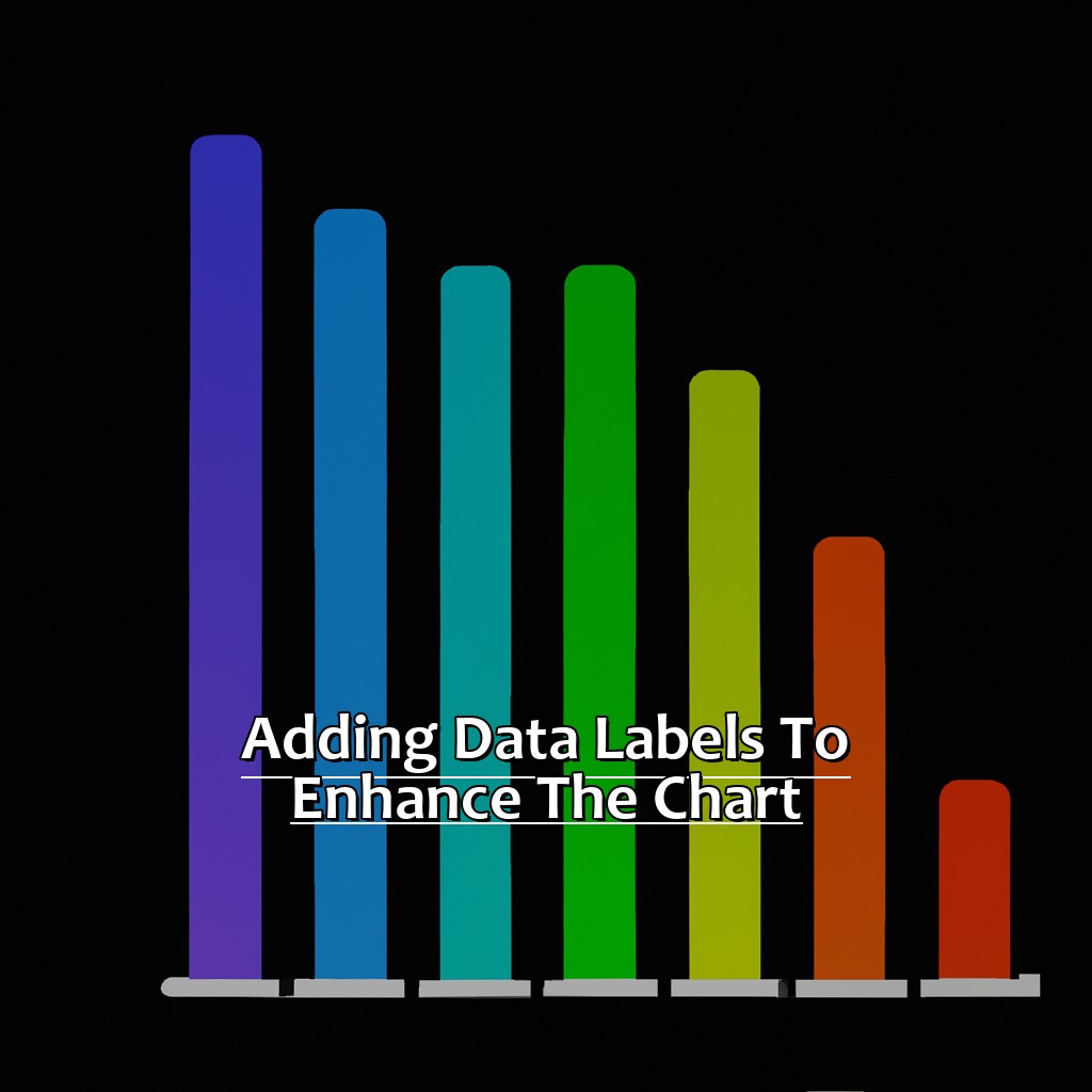
Image credits: manycoders.com by David Arnold
Choose the ‘Data Labels’ option
Choose the chart you want to give data labels. Go to the ‘Chart Elements’ button at the top right corner of your selection. Tick the box near ‘Data Labels’.
Now decide which data points need labels. Click one of them and pick ‘Format Data Labels’. This will give lots of options. Such as, labelling certain categories or values, changing font size/style or setting number format. Use these tools to make your chart attractive and easy to read.
By adding data labels, you don’t have to guess data points or struggle with gridlines, tick marks, color or legends. Take advantage of it and use it today!
Finally, select the data points that require labels- an essential part of designing charts with meaningful stories.
Handpick the data points that need labels
Firstly, select the chart to add labels to.
Then, click the Chart Elements button in the top right corner.
After that, hover over Data Labels, and click More Options.
Now, tick the Label Contains Value From Cells box in the Format Data Labels pane.
You can now start to choose which data points need labels. This process can be changed to your needs. Also, be sure the data points are useful and give value to the viewers of the chart. Avoid overwhelming them with too much info or cluttering up the chart.
When picking label positions, make sure they are readable and don’t overlap with other elements. To help with this, adjust the label position and size.
An interesting fact: According to Harvard Business Review, adding data labels can improve comprehension for viewers who may have trouble reading charts.
Next, let’s look at adjusting the label position as per the chart…
Adjust the label position as per the chart
Here’s the 4-step guide:
- Pick the needed data series.
- Right-click a data label on the chosen series.
- Select “Format Data Labels.”
- Under “Label Position,” pick the alignment that works best for your chart.
Remember, you can customize label position with “Label Options” under “Format Data Labels.” This provides more precise adjustments and better control over label location.
When adjusting label position, think about text size, font type, and color contrast. If labels are too small, make them bigger so they are easier to read. Additionally, you could use bold font or high-contrast colors to make labels stand out on the background.
Once, a team was showing the results of months of research using various types of charts at a significant meeting with stakeholders. But, due to wrong labeling and bad positioning of data points on one chart, stakeholders got confused and misread some vital insights. The team had to restart their presentation from the start and spend extra time fixing and improving their visual aids before going forward.
Next up: Formatting Data Labels for Improved Insights.
Formatting Data Labels for Better Insights
When it comes to analyzing data in Excel, adding formatting can help. Axis labels are a way to visually enhance the data. Let’s explore how to format data labels for more visual impact. We’ll cover customization areas, such as adjusting the font and size. We’ll also look at adding a prefix for quick reference. We’ve got everything you need to know about formatting axis labels in Excel!

Image credits: manycoders.com by David Arnold
Customize the font type, size, and color of data labels
To customize your data labels, select the chart with the labels you want to change. Click on a data label to select all labels of the same type. On the Chart Tools Design tab, click Data Labels > More Options. Under Label Options, select the font type, size, and color. To apply these changes to all data labels in the chart, click on Set as Default Label and hit Close.
By changing the font type, size and color, you can create a consistent pattern across all charts in your workbook. You can use larger fonts to make key insights stand out. Choose an appropriate color scheme for the data labels. If you have several sets of data, use different colors to distinguish them. Consider adding bold or italic text for emphasis. This can draw attention to specific points or trends in your chart.
Add a background fill or border to the label box
To add a background fill or border to a label box in Excel, start by selecting the data label. This will show the Chart Tools section on the ribbon.
Navigate to the Format tab and click on either the Shape Fill or Shape Outline drop-down menus. From here, choose from a range of colors and styles to customize the label’s appearance.
Alternatively, use the Format Data Labels dialog box. Right-click on the data label and select Format Data Labels. In this box, find options for Fill and Border to choose colors, patterns, and transparency levels.
Using a background fill or border can help data labels stand out more clearly. This is particularly useful when dealing with many labels or labels that need to be seen from a distance.
For example, presenting a financial report with graphs and charts to your boss. Add a solid color fill and/or border around each data label. This makes it easier for them to quickly interpret trends and make decisions based on your analysis.
Add a prefix or suffix to make data labeling more meaningful.
Add a prefix or suffix to make data labeling more meaningful
To add a prefix or suffix:
- Select the relevant cells in Excel.
- Go to the “Home” tab and find the “Number” area. Click on “More Number Formats”.
- Choose the desired format.
- Preview the labeling.
- Click “OK” and the chart will be updated.
Prefixes/suffixes offer additional context in datasets, without changing accuracy. It makes understanding easier, and adds complementary info for readers.
A study showed that 44% of flawed interpretation results in big business decisions came from poor visual representation.
Legends also help to complement a chart. They show different sets of data and clearly communicate what they mean, making it easier to make decisions.
Adding Legends to Complement Your Chart
Wondering how to make your Excel charts more legible? Here’s your answer! Add clear legends! Click on the ‘Legends‘ option. Then, select the data points for the legends. Finally, adjust the legend position to make it more user-friendly. Let’s get your Excel charts readable and interpretable!
Image credits: manycoders.com by David Duncun
Click on the ‘Legends’ option
Choose the chart to work on.
Click ‘Layout’ in the ‘Chart Tools’ section of the ribbon menu at the top of the screen.
Select ‘Legend’ from the options, such as ‘Axis’.
This will give you some great customization options to make your charts look amazing. Legends are a great way to show important info, like what each color means, without making the chart too cluttered.
You can choose where the legend goes, such as the top, bottom, or left side of the graph. This is helpful for maps and displays with multiple categories, like time zones or geographical areas. It makes it easier for people to understand the data.
Also, pick colors and patterns that will be easy to read. It’s best to use contrasting colors for different groups of data, and the same color scheme across all charts in the project.
Now let’s talk about picking data points where legends need to be added.
Pick the data points where legends need to be added
Pick data points for legends by first deciding which data’s most important. This will help you figure out which parts of the chart need extra info. Look for trends or patterns that emerge from the chart. If there are outliers, give more context. Also, make sure what you’re showing is easily understood. Consider what viewers may want to know and how to give that info in a clear, effective way.
Once you know where legends should go, use Excel tools like text boxes, formulas, and macros to create them. Try different methods until it works well and communicates your message.
Adjust the legend position to make it more user-friendly
Want to make your chart more user-friendly? Adjusting the legend position is key! Here’s five steps to guide you:
- Select the chart and click “Design” from the Excel menu.
- Then, click on “Select Data” at the top right.
- Select “Legend Entries (Series)” and click “Edit.”
- In the Edit Series window, choose a new position under “Legend Position.”
- Once you’re done, click “OK” to close out of all windows.
Adjusting the legend position can help improve a chart’s visual appeal and readability. Placing the legend to the right or left avoids data point overlap, for example.
Font size and style should also be considered when making adjustments to legends. A larger font size can help them stand out better. Changing font styles and colors adds contrast, making it easier to distinguish between categories or series.
Robert Kosara’s study found that legends can help readers understand charts better by directing their attention. Small adjustments like moving and formatting legends can boost usability for the audience.
Five Facts About How to Add Axis Labels in Excel:
- ✅ Axis labels are used to provide context and understanding to the data being displayed in charts and graphs in Excel. (Source: Microsoft)
- ✅ To add axis labels to an Excel chart, select the chart and click on the “+” symbol that appears when you hover over the chart area. (Source: HubSpot)
- ✅ After clicking on the “+” symbol, select “Axis Titles” from the drop-down menu and choose the type of axis title you want to add (e.g. “Primary Horizontal”). (Source: Excel Easy)
- ✅ You can customize axis labels by changing the font, size, color, and alignment in the “Format Axis Title” pane. (Source: Business Insider)
- ✅ Adding clear and descriptive axis labels is crucial to effectively communicating data in Excel charts and graphs. (Source: Datawrapper)
FAQs about How To Add Axis Labels In Excel
How to Add Axis Labels in Excel?
Excel allows you to add axis labels to your chart to make it more understandable. Here are the steps to add axis labels in Excel.
What are Axis Labels in Excel?
Axis labels in Excel are the labels that are displayed on the horizontal and vertical axes of a chart. They provide context and meaning to the chart’s data.
How do I add a Horizontal Axis Label in Excel?
To add a horizontal axis label in Excel, follow these steps:
- Select the chart you want to add the label to.
- Select the Layout tab from the Ribbon.
- Select Axis Titles and then Primary Horizontal Axis Title.
- Enter the title you want to give your axis.
How do I add a Vertical Axis Label in Excel?
To add a vertical axis label in Excel, follow these steps:
- Select the chart you want to add the label to.
- Select the Layout tab from the Ribbon.
- Select Axis Titles and then Primary Vertical Axis Title.
- Enter the title you want to give your axis.
Can I edit the Axis Labels in Excel?
Yes, you can edit the axis labels in Excel. Simply click on the label and begin typing to edit it. You can also change the font, size, and color of the label by selecting it and formatting it using the Home tab on the Ribbon.
What if I want to remove Axis Labels in Excel?
To remove axis labels in Excel, follow these steps:
- Select the chart you want to remove the label from.
- Select the Layout tab from the Ribbon.
- Select Axis Titles and then click on None.